
Data
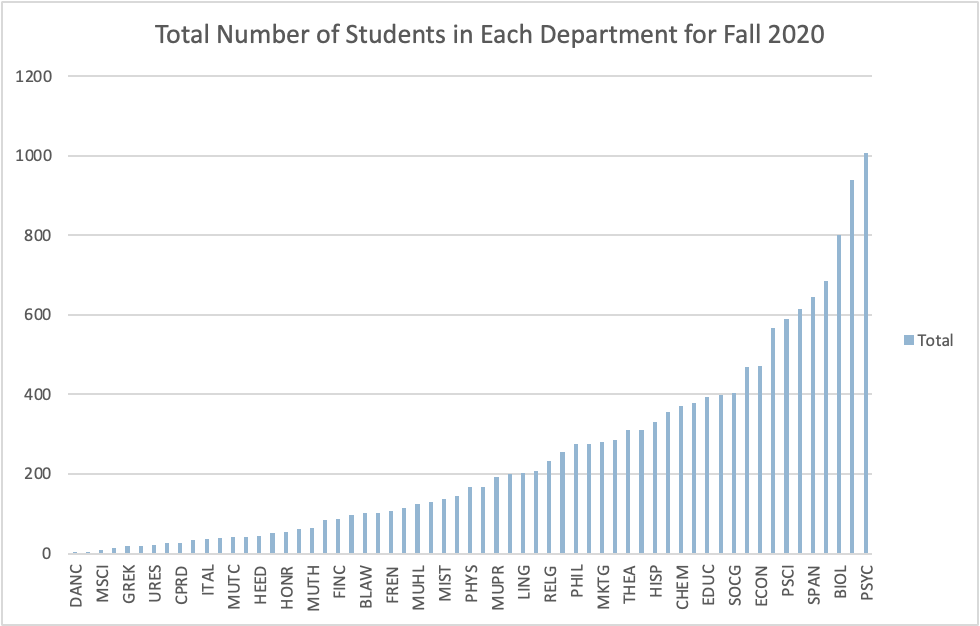
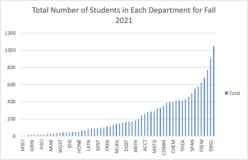
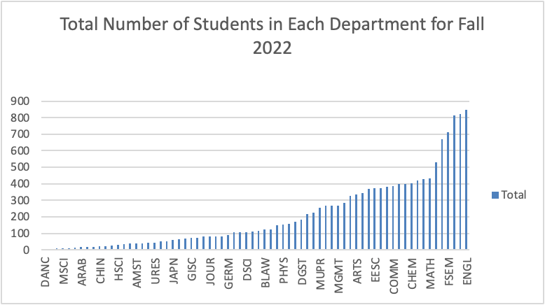
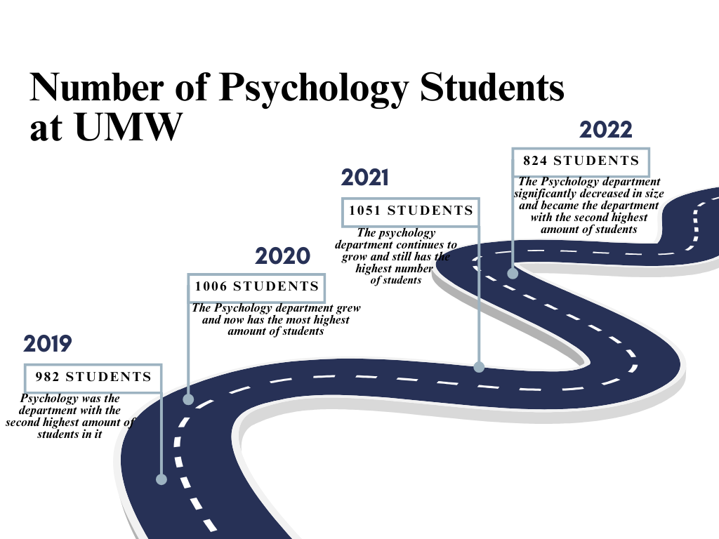
These graphs show the difference between how many people participated in each course for Fall 2019, 2020, 2021, and 2022. I based my data around Fall 2020 and added the data from the year before and the two year afters to show the differences in amount of students per each course at the University of Mary Washington. For my graph I created on Canva I used the data showing the number of psychology students over the time period of four years to show how much it changed overtime. This helped show the difference between the amount of student pre-pandemic compared to post-pandemic in the Psychology department. It shows how the number of Psychology students significantly increased when the pandemic occurred and how the number of students drastically decreased in 2022.
The Process
Using Canva was pretty simple to use. I used the White and Blue corporate modern Timeline Graph template by Equipo de Pronoia Studio because it helped show my data without making it appear too complex. My goal was to show how the number of Psychology students increased and decreased over the span of four years, To make the initial four graph I used Microsoft Excel and took the data from the original spreadsheets, which provided more even more specific data about students at UMW over the past couple of years, and I made simple PivotTable to show just the specific data I wanted.
For Each year I made a PivotTable that also includes the breakdown of the exact number of students in each department: